Actions
Bug #24981
openApi account tenants selection UI is hindered by ACL
Pull Request:
Severity:
Minor - inconvenience | misleading | easy workaround
UX impact:
It bothers me each time
User visibility:
Operational - other Techniques | Rudder settings | Plugins
Effort required:
Small
Priority:
50
Name check:
To do
Fix check:
To do
Regression:
No
Description
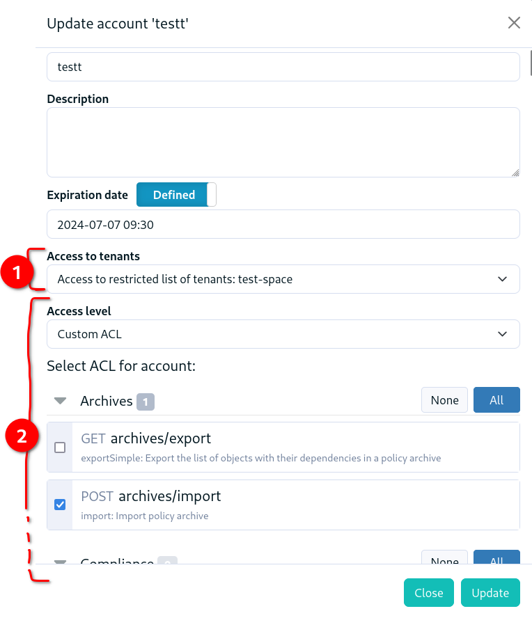
When creating or editing an API account, we can select tenants to which it applies, and ACL for the account.
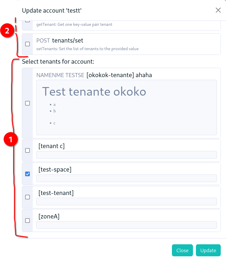
But when selecting custom ACL, the bottom of the form is filled with the very long selection for ACL, and the selection of tenants is after the bottom of that list, instead of being right below the select field for tenants :


Files
Actions