Actions
Bug #2675
closed
Buttons in group screen are in confusing places
Status:
Released
Priority:
2
Assignee:
Jean VILVER
Category:
Web - Nodes & inventories
Target version:
Pull Request:
Severity:
UX impact:
User visibility:
Effort required:
Priority:
Name check:
Fix check:
Regression:
Description
When editing a group, the three buttons are at the bottom of the screen in this order: Clone Update Delete.
This is confusing, because:- We always have the "default" rule at the bottom right everywhere. So "Update" should be on the far right.
- In the Directive and Rule screens, the Delete button is in a separate frame at the top of the screen. I think we should do the same in this screen. The Clone button could go there as well.
Files
 Updated by Jean VILVER
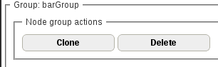

 Updated by Jonathan CLARKE
  Updated by
Actions