Actions
Bug #4591
closedSeveral issues with new display of Rules
Status:
Rejected
Priority:
1 (highest)
Assignee:
Category:
Web - Config management
Target version:
Pull Request:
Severity:
UX impact:
User visibility:
Effort required:
Priority:
Name check:
Fix check:
Regression:
Description
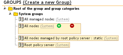
I just checked out the new display of Rules added in #4505, but have several display issues on my Firefox browser, as these screenshots show:


In particular, what is wrong:
- The size of the "highlight" box in the tree when I hover over an item is huge, and the + and - icons are miles apart from each other and the text
- Items in the two sections on the right are not displayed correctly (they don't have a box around them, they seem to drift from left to right, etc)
- The titles of the two boxes on the right are preceded by the question mark, that shuold come afterwards
- The " (Create a new Directive)" and " (Create a new Group)" links are far too big, and should be much more discrete (think half the current size, no bold, and in grey)
Files
Actions