Actions
User story #10748
closed
Color of popup should be accorded to its meaning
Status:
Rejected
Priority:
N/A
Assignee:
-
Category:
Web - UI & UX
Target version:
Pull Request:
UX impact:
Suggestion strength:
Wish - This is just an idea | nice to have
User visibility:
Effort required:
Small
Name check:
Fix check:
Regression:
Description
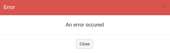
Currently, all of the popups have an orange bandeau, the same orange than the Rudder's menu bar.
It can be pretty confusing for a new user to see appearing an orange pop up following a successful action.
Bandeau color should be accorded to the popup meaning (for example, see attached files).
Files
| success_popup.png (6.41 KB) success_popup.png | Success popup | ||
| error_popup.png (4.36 KB) error_popup.png | Error popup |
 Updated by
  Updated by
  Updated by
  Updated by
  Updated by
Actions