Actions
Bug #14287
closed
Technique list space optimization
Status:
Resolved
Priority:
N/A
Assignee:
Category:
Web - Technique editor
Target version:
Pull Request:
Severity:
Trivial - no functional impact | cosmetic
UX impact:
User visibility:
Getting started - demo | first install | Technique editor and level 1 Techniques
Effort required:
Very Small
Priority:
63
Name check:
Fix check:
Regression:
Description
Hi Frontend Team,
Techniques in the Technique Editor have their label "cropped" in a ugly manner. Is it possible top optimize this by reducing margin and maybe find a better way to invite the user to click than the arrow that took space ? Maybe with a colored bar on the right for the selected Technique, instead of gray bar for the others ?
Files
 Updated by
  Updated by
  Updated by
  Updated by
  Updated by
  Updated by
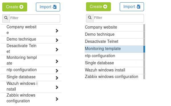
Actions